Tutorial

Split Scroll Screen - Sticky column - Squarespace FREE Tutorial

Fluid engine - Squarespace 7.1 - CSS - medium experience needed

In 2022, Squarespace introduced Fluid Engine, the new editor based on the CSS grid.

It’s totally easy to make a split screen now. You fill half of the grid with some text, and the other half with images. Easy peasy. The possibilities are endless and it adds a bit of creativity to your website. In this tutorial we have a sticky text block on the left, and scrolling text and images on the right.

Instructions

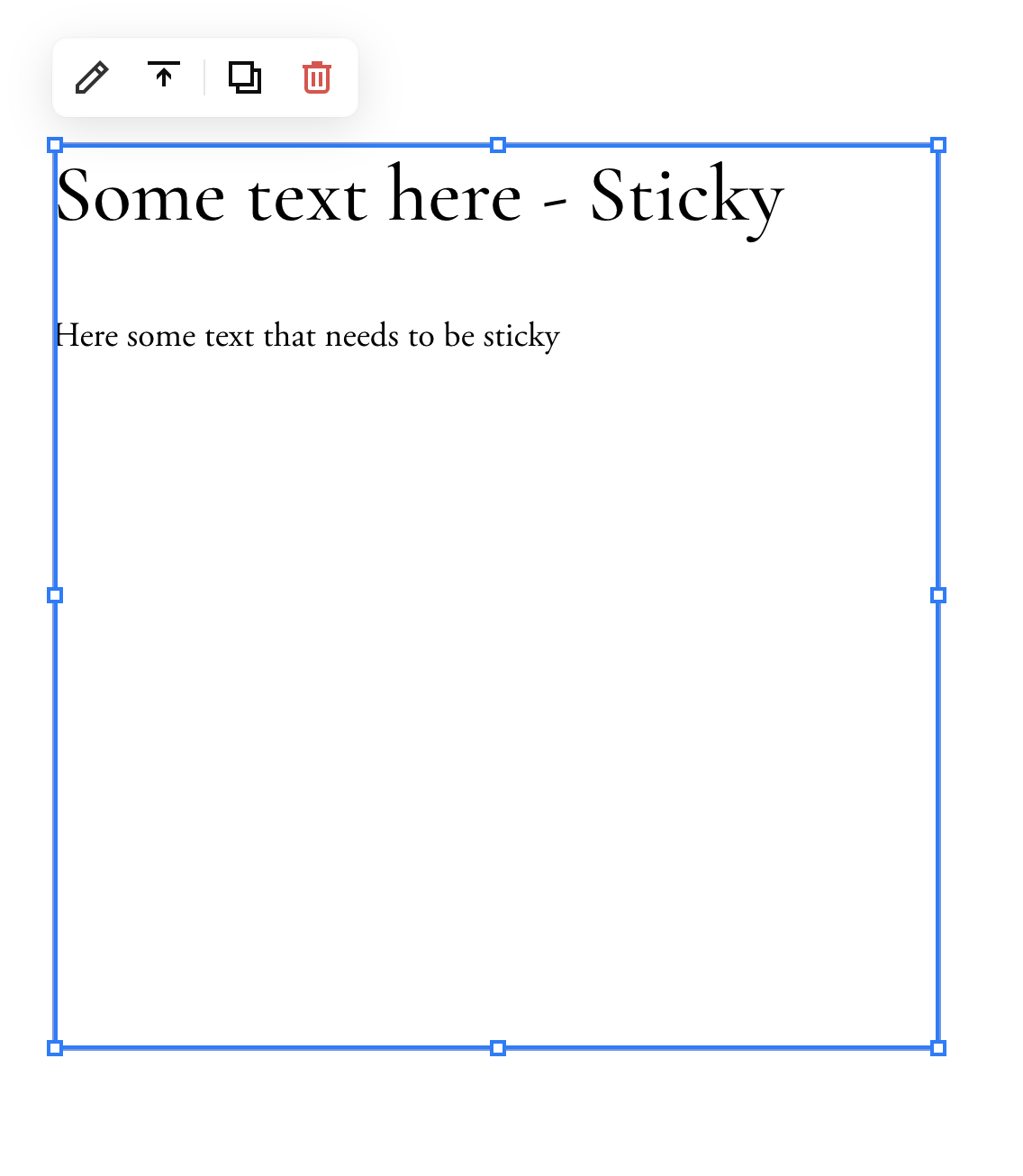
  1. Create your section as you want. You need to create visually 2 columns to make the ‘split-screen-sticky’. You can add an image on the left, and text on the right, or vice versa. The split in columns, doesn’t have to be in the middle, you can make both of the columns as wide as you like. Make sure that the block with text or image that is going to stick, is just 1 block. (to add multiple items to one block, use a code block).
  2. Check the mobile version. With fluid engine the blocks appear in the order you’ve added them, so you might need to reorder them in the mobile view. The split sticky section + scrolling won’t work on mobile view, as this is not user friendly. After this go back to the desktop view.
  3. Decide which column you want to ‘stick’ to the top and which column you would like the scrolling to happen.
  4. Use the Squarespace ID finder Chrome extension to find the block ID’s and data-section ID. The date section ID is the ID of the section which has your sticky column and scrolling column.
  5. Copy the CSS code below and replace the CAPITAL CODE with the ID’s from your section and the block you want to be sticky. (scroll to right on mobile view). If you want to have a bit more space at the bottom of your sticky block, make the block longer in the editor.
@media only screen and (min-width: 700px) {
// Add these lines for your section to be on flex display //
section[data-section-id="HERE_YOUR_SECTION_ID"] {
  display: flex;
  flex-direction: row;
}

// Add these lines for your column to be sticky and stick to the top + 80px, you can adjust this to your liking //
section[data-section-id="HERE_YOUR_SECTION_ID"] .fe-block-HERE_YOUR_BLOCK_ID {
  position: sticky !important;
  top: 80px !important;
} 
  
// Add these lines to be able to edit your section and blocks as usual //
section[data-section-id="HERE_YOUR_SECTION_ID"] .is-editing div .fe-block-HERE_YOUR_BLOCK_ID {
  position: absolute !important;
  top: 0px !important;
}
  
}

For me this results in this CSS code below. 

@media only screen and (min-width: 700px) {
// Add these lines for your section to be on flex display //
section[data-section-id="6350bc39bef1b81b610d3697"] {
  display: flex;
  flex-direction: row;
}

// Add these lines for your column to be sticky and stick to the top + 80px, you can adjust this to your liking //
section[data-section-id="6350bc39bef1b81b610d3697"] .fe-block-yui_3_17_2_1_1666291546789_152701 {
  position: sticky !important;
  top: 80px !important;
} 
  
// Add these lines to be able to edit your section and blocks as usual //
section[data-section-id="6350bc39bef1b81b610d3697"] .is-editing div .fe-block-yui_3_17_2_1_1666291546789_152701{
  position: absolute !important;
  top: 0px !important;
}
  
}

That’s it.

You have your section split in 2 columns, one sticky and one scrolling. 

I hope you enjoyed following this tutorial and get in touch if you have any questions.